Masonry vs. Grid: Choosing the Right Gallery Layout
Masonry, uniform grid, or a large editorial layout? How to pick the gallery style that makes your photography shine.
Short answer
Masonry preserves each photograph's own proportions and suits mixed orientations and storytelling sets, while a uniform grid crops everything to a consistent shape and suits catalogues, products and large volume deliveries. If your set mixes portrait and landscape frames, masonry avoids the crops that a grid forces on you.
The layout you choose changes how your work is read before a single photograph is examined. The same forty frames arranged as a tight uniform grid feel like a catalogue; arranged as a flowing masonry wall they feel like a story; shown one enormous frame at a time they feel like an exhibition. None of those is wrong — they're answers to different questions.
This is a practical guide to picking a gallery layout: what each one does to the viewer, which shoots suit which, how orientation and count change the answer, and the mistakes that make good photography look worse than it is.
Table of Contents
- What a layout is actually doing
- The layouts, one by one
- Choosing by what you shot
- The orientation problem nobody warns you about
- How photo count changes the answer
- Four common mistakes
- Layout versus theme
What a layout is actually doing
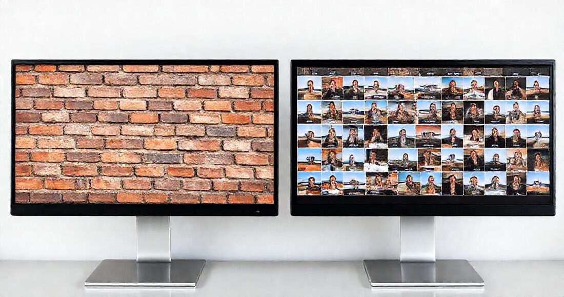
A gallery layout makes three decisions on your behalf: how much space each photograph gets (equal, or weighted), whether images are cropped to fit a shape, and what rhythm the eye follows down the page. Everything below is a consequence of those three.
The underlying tension is simple. Uniform shapes create calm and comparability but crop your compositions. Natural proportions preserve every frame exactly as you made it but create an irregular, busier page. Which you want depends on whether the client is choosing photographs or experiencing them.
The layouts, one by one
Masonry
Columns of photographs at their natural proportions, each dropped into the currently-shortest column so the page stays balanced. Nothing is cropped, verticals stay vertical, and the eye moves down the page in a natural reading order.
Best for: weddings, events, editorial and travel — anything with mixed orientations and a narrative. It's the default for good reason: it's the only layout that never lies about your framing.
Uniform grid
Every thumbnail cropped to the same square. Maximum calm, maximum comparability, and the client can scan a hundred frames quickly. The full image is always intact in the lightbox — only the thumbnail is cropped.
Best for: headshots, product sets, real-estate listings, and proofing, where consistency helps the client choose rather than admire.
Large
Fewer, bigger frames per row. Slows the viewer down and gives each photograph room to be looked at rather than scanned.
Best for: small curated sets, portfolios, fine-art work, and the first fifteen frames of a wedding if you're presenting a highlight gallery separately.
Mosaic and feed
Mosaic packs more images per row for dense sets — useful when a gallery runs to many hundreds of frames and scrolling forever is the real enemy. Feed shows one image per row at full width, an unhurried vertical scroll that suits storytelling sequences and mobile-first audiences.
Frame and spotlight
Frame presents each photograph matted on a card, like prints laid on a table — quietly effective for selling albums and prints because it shows work as objects. Spotlight pairs one large feature image with a thumbnail rail, closer to how a portfolio project page reads.
Choosing by what you shot
| Shoot | Layout | Why |
|---|---|---|
| Wedding (full day) | Masonry | Mixed orientations, long narrative, nothing cropped |
| Headshots / corporate | Grid | Comparability is the client's actual task |
| Real estate listing | Grid | Agents scan fast; uniformity reads as professional |
| Portrait session proofing | Grid | Choosing, not admiring |
| Portfolio / highlights | Large or Spotlight | Fewer frames, more weight each |
| Conference or festival (500+) | Mosaic | Density beats scrolling |
| Album preview or print sales | Frame | Photographs presented as objects |
| Story sequence / mobile-first | Feed | One frame at a time, unhurried |
The orientation problem nobody warns you about
A set that's 90% vertical behaves very differently from a mixed set. In masonry, all-vertical galleries produce very tall columns and a page that scrolls a long way; in a grid, verticals lose the most to the square crop — a full-length portrait becomes a torso.
Two practical responses. If the set is mostly vertical, Large or Feed respects it better than a grid does. And if you're using a grid for proofing anyway, make sure your cover photo is horizontal — the cover is the one image that gets cropped hardest, and a vertical hero on a wide screen loses its subject.
How photo count changes the answer
- Under 30: Large or Frame. There aren't enough images for density to matter, and each frame can afford the space.
- 30–150: Masonry. The sweet spot — enough for rhythm, not so many that scrolling is a chore.
- 150–600: Masonry with sections. This is where naming your subfolders stops being tidy and starts being necessary; a client jumps to Ceremony rather than scrolling past it.
- 600+: Mosaic with sections, and consider delivering a curated highlight gallery alongside the full set. Nobody browses nine hundred frames in one sitting.
Four common mistakes
- Choosing the layout you like instead of the one the client needs. Frame is lovely; it's wrong for a hundred proofing shots.
- Grid for a wedding. Square-cropping a day's worth of intentional compositions undoes your framing at exactly the moment the client is judging it.
- One giant undifferentiated gallery. Layout can't rescue structure. Use sections.
- Never checking it on a phone. Most client galleries are opened on a phone first. Every layout collapses to fewer columns there — look at it before you send it.
Layout versus theme
They're different controls and it's worth keeping them straight. Layout is arrangement — how photos are placed. Theme is identity — typography, colour, cover style, the feel of the page around the photographs. A Noir theme with a masonry layout and an Editorial theme with the same layout are different galleries entirely.
Pick the layout for the client's task, then the theme for your brand — in that order. Both are switchable after delivery without changing the link, so a gallery that isn't landing can be re-styled in ten seconds while the client's tab is still open. The docs list every option, and the live preview when you create a gallery shows your own photos in each before you commit.