What’s New in GalleryLink: Reframe Your Cover, a Dashboard That Points You at What Matters, and an App on Your Phone (October 2026)
This week’s GalleryLink update: drag to choose what part of your cover photo stays in view, dashboard cards that show status, views, downloads and when a client last opened a gallery, search and filters, a create form built for phones with a floating live preview, home-screen install, and Sign in with Apple.
Short answer
This week GalleryLink added five things. You can now drag a window over your cover photo to choose the part that stays in view, so a wide header never cuts off faces. Dashboard cards show each gallery’s status, views, favourites, downloads and when your client last opened it, with search, sort and a “Needs attention” filter. On a phone, the create form folds into four sections with a floating live-preview button and the Create button pinned to the bottom. GalleryLink can be added to your home screen and opens like an app. And you can sign in with Apple.
Most of this week’s work came from watching how galleries actually get made and checked: on a phone between shoots, in a hurry, with one question in mind (has my client seen it?). Here is what changed and how to use each part.
Choose what your cover shows
A gallery’s header is far wider than any photograph, so the cover is always cropped. Until now it was cropped around the centre, which is exactly where a portrait loses the top of everyone’s head.
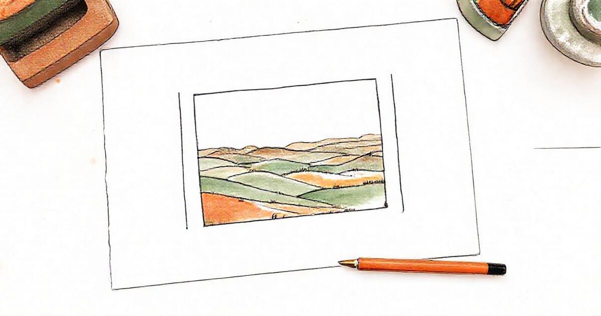
Now, under Cover position in the Look section of a gallery’s settings, you see the whole cover photo with a bright window over the part that will show. Drag the window, or tap the spot that must stay in view. Arrow keys nudge it if you prefer the keyboard. The preview beside the form updates as you move it.
The same framing is used everywhere that cover appears: the gallery’s header, the framed covers of custom styles, your dashboard card and the gallery’s card on your studio page. Choosing a different cover photo starts the new one centred, since a different photo needs its own framing.
If you build galleries with “Make it with me”, you can drag the cover in its live preview too, and new galleries made that way start framed a third of the way down, where faces usually are, instead of dead centre.
Nothing changes for galleries you have already shared until you move the window yourself.
A dashboard that tells you what needs you
Gallery cards used to show a cover, a long link and a row of buttons. The questions you actually open the dashboard with weren’t answered anywhere. Each card now shows:
- Status on the cover: Live, Expires in 20h, Expired, Not shared yet, and a lock when it has a password.
- When your client last opened it, alongside the date you made it and where the photos live: “7 Oct · Drive · Opened 1h ago”, or “Not opened yet”. Uploaded galleries show their photo count.
- Views, favourites and downloads in one strip. Downloads weren’t shown anywhere before; each number opens its page.
- What’s switched on: client selection, album, guest uploads, watermark. If guests have added photos, the chip shows how many and opens them.

The buttons are now one row on every card, so they line up across the grid. Share comes first, then View and Edit. Everything you need less often (Photos for uploaded galleries, Copy link, Stats, Favourites and selections, and Delete) sits in the ⋯ menu, so a red Delete button is no longer on every card.
Once you have four or more galleries, a toolbar appears above them:
- Search by title.
- Sort by newest, recently opened by your client, most viewed, or A to Z. Your choice is remembered on that device.
- Filter to Needs attention (expiring within two days, expired, not shared yet, or a selection waiting for you), or to Drive or uploaded galleries if you use both.
“Recently opened” is the one we use most: it puts the galleries your clients are looking at right now at the top.
Making a gallery on your phone
About four in ten visitors arrive on a phone, and the create form was a single long page built for a laptop: around six screens of scrolling, with the Create button at the very bottom and the live preview below everything else, where you couldn’t see your choices take effect.
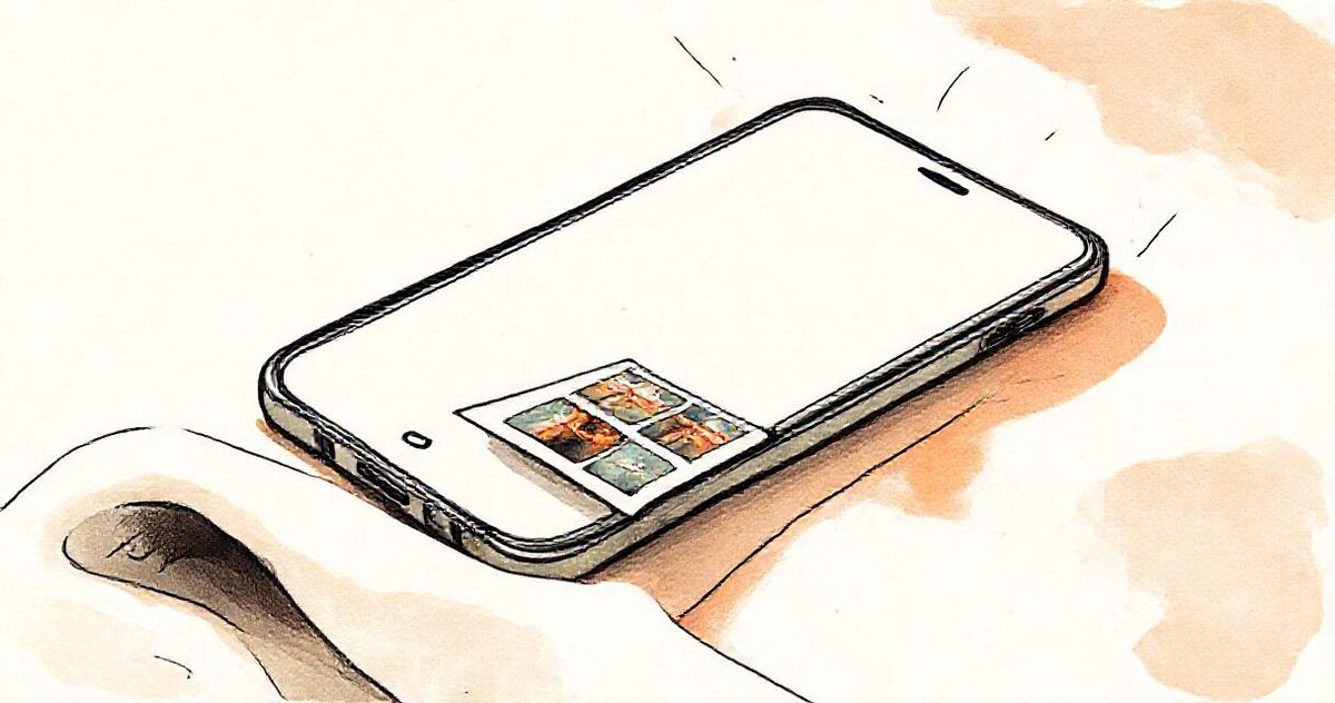
The form now folds into four sections: Name & photos, Look, Client options and Links. Folded sections show a short summary (“Masonry · Editorial”, “Downloads on · Selection”), so the page reads like a checklist and is about a quarter of its old length. If you press Create with something required still empty in a folded section, that section opens to show you what’s missing.
On a phone, a round preview button floats in the corner, wearing a little picture of your cover, and pulses when you change something that affects the look. Tap it and the live preview slides up full screen; swipe it down, or use your phone’s back gesture, and you are exactly where you were in the form. Create gallery stays pinned to the bottom of the screen, so finishing never needs a scroll.
Smaller things that add up: text fields no longer make iPhones zoom in when you tap them, and if you upload rather than use Drive, the upload box now says Choose from Photos and opens your photo library, instead of asking you to drag files you can’t drag on a phone.
On a computer the sections fold the same way, with the preview beside the form as before. When you edit an existing gallery, every section starts folded, because you usually came back to change one thing.
GalleryLink on your home screen
You can now add GalleryLink to your phone’s home screen. It gets its own icon, opens full screen without the browser bar, and goes straight to your galleries.
- Android (Chrome): once you have a gallery, a small tip on your dashboard offers an Install button. Long-press the icon afterwards for a New gallery shortcut.
- iPhone (Safari): tap the Share button, then Add to Home Screen. The dashboard tip shows you where.
It is the same GalleryLink, with the same account and galleries, just one tap away.
Sign in with Apple
The login and sign-up pages now have Continue with Apple beside Continue with Google. If Apple shares the email address you already use with us, you’re signed into that account. If you choose Apple’s Hide My Email, Apple gives us a private relay address instead, which creates a new account, so use the shared email if you already have galleries. The login page also now tells you plainly when a Google or Apple sign-in doesn’t go through, instead of quietly returning you to the form.
What’s next
We’re watching how the new phone form does (whether more galleries get finished on phones) and which dashboard filters get used. If something feels slower than it should, or a card is missing the one thing you look for, reply to any of our emails and tell us. Everything shipped is also on the changelog, and if you haven’t tried it yet, make a sample gallery and drag its cover around.