Turn a Google Drive Folder into a Product Catalogue
Make a live product catalogue from the folder you already keep: subfolders become categories, filenames become product names, and updating the folder updates the page. No PDF, no site builder.
Short answer
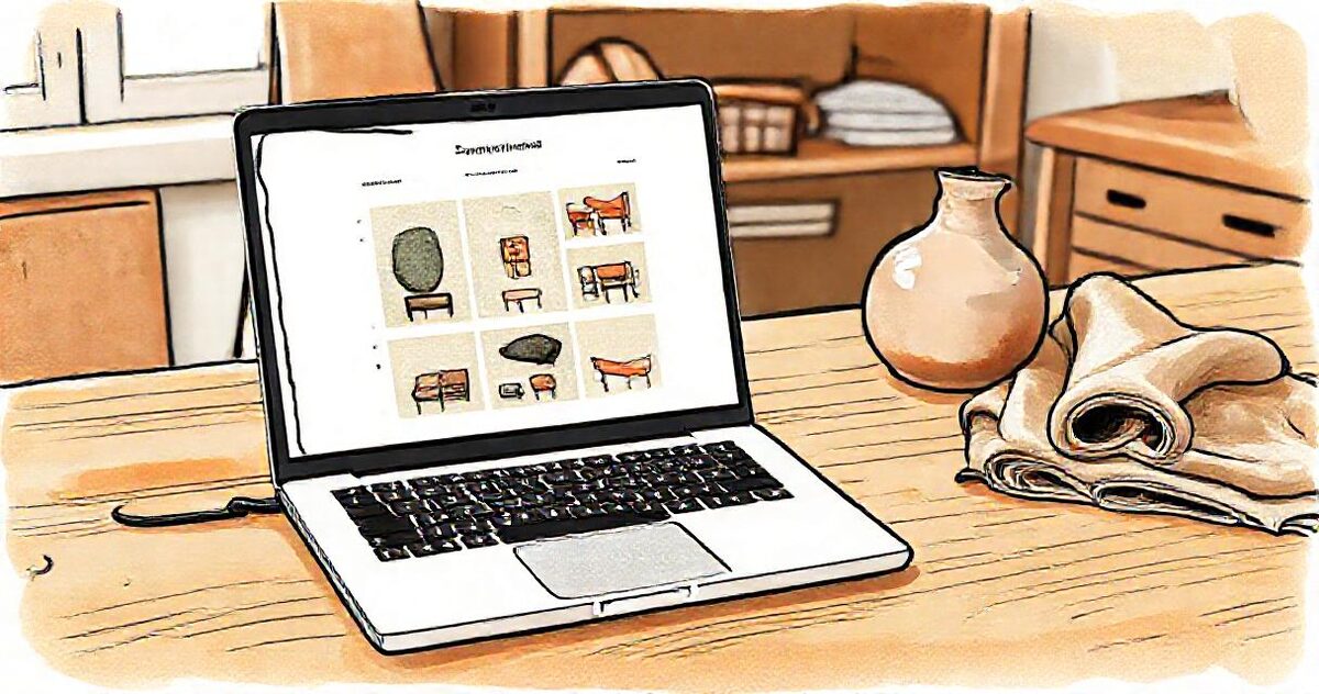
Organise product photos into one Drive subfolder per category, name each file as the product, and point a GalleryLink catalogue gallery at the folder. Categories become sections, filenames become the names under each photo, and the catalogue updates whenever the folder does. A password on a second gallery over the same folder makes a trade view.
Somewhere in your Drive there is already a folder of product photos. It is probably organised better than your website: one subfolder per range, files named after the products, updated the day something new is photographed. The conventional next steps all throw that organisation away. Export a PDF and it is stale within the month. Rebuild it in a website builder and the photos now live in two places, and only one of them is ever current. Send the raw folder link and your customer gets a file manager with a grey toolbar.
There is a shorter path: the folder itself becomes the catalogue.
- Why the folder is already the best version
- Step 1: Organise the folder like a catalogue
- Step 2: Name files like products
- Step 3: Turn it into a catalogue gallery
- Step 4: One link, everywhere
- Making the grid look expensive
- Updating: there is no step 5
- New arrivals, sold out, and last season
- A trade view beside the public one
- From browsing to buying
- Reading what buyers actually want
- When someone insists on a PDF
- Five mistakes worth avoiding
- What this is not
- The whole thing on one page
- Common questions
Why the folder is already the best version
Every catalogue eventually fails in the same way: the photos change and the catalogue does not. A PDF is a photograph of a moment. A website builder is a second home for pictures that already live somewhere, and second homes drift. Both formats ask you to maintain the same information twice, and the copy that customers see is always the older one.
The folder does not have that problem, because the folder is where the work already happens. When a new piece is photographed it goes into the folder that day. When something is discontinued it leaves. Nobody has to remember to publish, because there is nothing to publish. If the page simply reads the folder, then the page is correct by construction rather than by discipline.
That is the whole idea. Everything below is just the practical detail of doing it well.
Step 1: Organise the folder like a catalogue
The folder structure becomes the page structure, so arrange it the way a customer should browse, not the way the photos were shot:
| In Drive | On the page |
|---|---|
| The main folder | The catalogue itself |
| Subfolder "Chairs" | A Chairs section with a jump link |
| Subfolder "Tables" | A Tables section |
| Loose photos in the root | A lead section at the top, good for new arrivals |
Ten to fifteen categories is comfortable; on a phone the category bar scrolls sideways, so a long range works. Within a category, files sort naturally, so a numeric prefix (01-, 02-) controls order where order matters.
Step 2: Name files like products
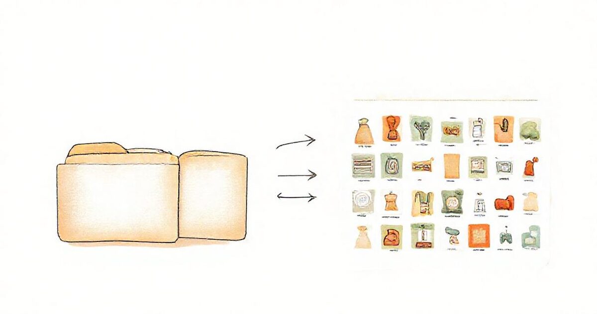
In a catalogue gallery, the filename appears under the photo. So banqueta-austria.jpg renders as Banqueta Austria: the extension goes, hyphens become spaces, capitals arrive. If you write the name with its own capitals or accents, it is shown exactly as typed.
This sounds small and is actually the whole trick. Your file naming discipline, which you already have, becomes your product labelling, which you thought you needed a database for. Prices can ride along the same way ("Oslo Dining Table · from $890") or stay out of the catalogue entirely, which many wholesale sellers prefer.
For galleries you upload directly to GalleryLink instead of linking from Drive, there is also a caption field per item in the Photos manager, which overrides the filename without renaming anything.
Step 3: Turn it into a catalogue gallery
- Share the folder as "Anyone with the link" and paste it into a new gallery, or upload the photos directly.
- Tick "This is a product catalogue" in the gallery settings. This is what switches names on under the photos and turns the favourites heart into a shortlist.
- Pick a theme in your brand colours and a grid layout. Set a cover.
That is the entire build. No templates, no drag and drop, no plugin. The product catalogue guide shows the finished shape.
Step 4: One link, everywhere
The same address goes in the Instagram bio, the WhatsApp auto-reply, the email signature and the QR card on the counter. When someone asks "do you have a catalogue?", the answer is one link that opens instantly on a phone, with no app, no account and no download.
That is the practical difference from a PDF, which on a phone means downloading a file, finding it, and pinch-zooming through pages designed for A4. The full comparison is in catalogue versus PDF.
Making the grid look expensive
A catalogue grid is judged in about two seconds, and what people react to is consistency rather than resolution. A few habits do most of the work:
- Pick one background and stay with it. A range shot on the same paper or the same wall reads as a collection. The same range shot half on white and half in a living room reads as a folder.
- Keep the subject the same size in the frame. Wildly different crops make a tidy grid look restless, even when every photo is good.
- Lead with the hero angle. The first photo of each product is the one the grid shows, so it should be the angle that sells, not the detail shot. Detail shots belong after it.
- Do not upload the raw camera file. Long-edge 2000 to 3000 pixels is plenty for a catalogue and keeps the page fast on a phone. Previews are resized for the grid, but the original is still what gets fetched when someone opens an item.
- Shoot the odd sizes deliberately. Very tall or very wide products stand out in a masonry layout, which is useful when it is intentional and distracting when it is not.
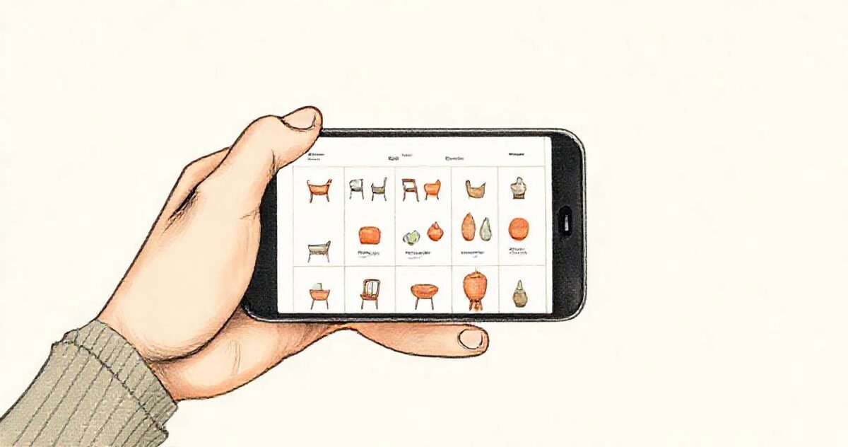
Most catalogues are opened on a phone, usually while someone is talking to you, so the phone view is the real view. Categories become a bar that scrolls sideways, tapping a photo opens it full screen, and swiping moves through the range.
Updating: there is no step 5
New product photographed, dropped into its subfolder, live in the catalogue. Sold out, removed, gone. Renamed, relabelled. Because the gallery reads the folder on each visit, there is no export step, no publish button, and no version four of the PDF in six inboxes. The link you shared last year shows this year's range.
New arrivals, sold out, and last season
Three moves cover most of the catalogue calendar, and all three are folder operations:
- New arrivals. Photos sitting loose in the main folder show above the categories, which makes the root folder a natural "new in" shelf. Move them into their category when they stop being new.
- Sold out. Take the file out of the folder and it leaves the catalogue. If a piece is coming back, move it to an "Archive" folder outside the catalogue folder rather than deleting it.
- Last season. A second gallery pointed at an archive folder gives you a quiet link for the pieces you still sell occasionally, without crowding the main range.
Order inside a category follows the filename, so a numeric prefix is the simplest way to put the pieces you most want seen at the top. Buyers can also re-sort by newest, which is useful when your naming is alphabetical but your range is not.
A trade view beside the public one
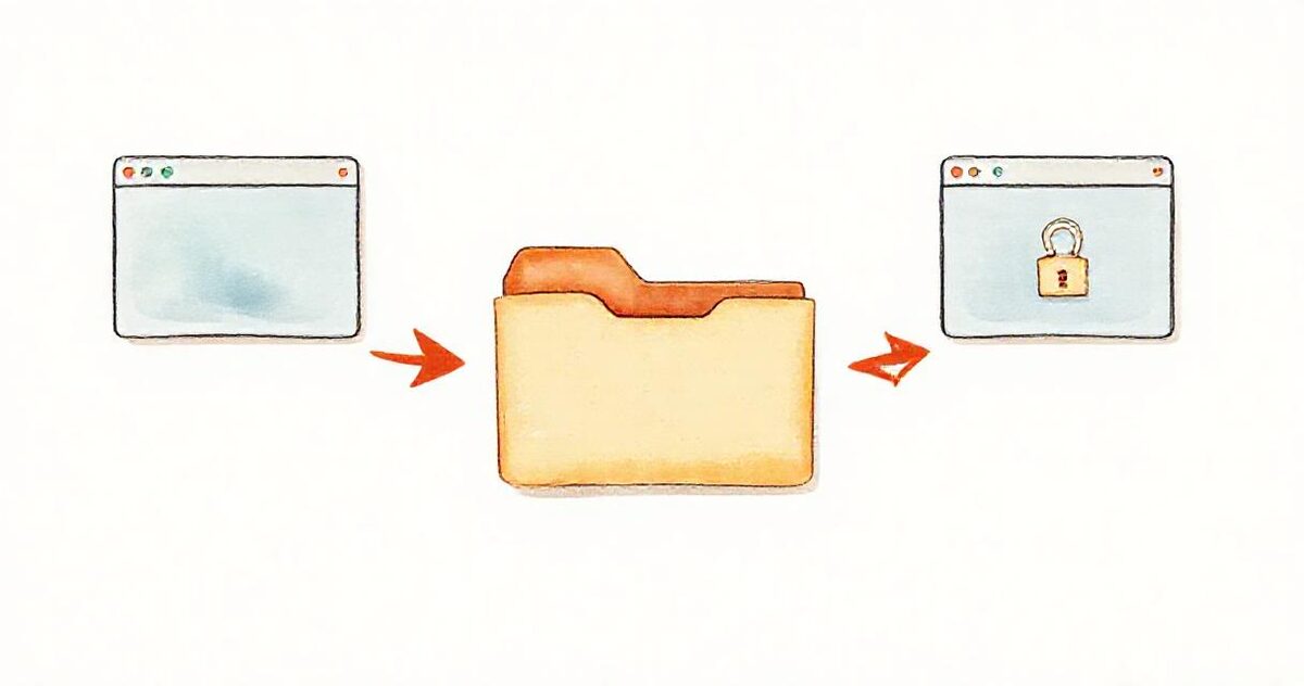
Wholesale and retail want different things from the same photos. Make a second gallery over the same folder and password-protect it: stockists get the password and a version with trade prices in the captions, the public link stays clean. One folder of photos, two catalogues, nothing to keep in sync, because there is nothing duplicated. The workflow is the same as sharing product photos with retailers.
From browsing to buying
A catalogue gallery gives a buyer two actions a brochure never had:
- Ask about this item. Every photo carries a button that sends you their question with the product name attached automatically. It lands in your inbox with reply-to set, and in your dashboard's inquiry list.
- The shortlist. Buyers heart the pieces they are interested in and send the list. What comes back is exact product names, not "the third chair on the page with the arms".
Deliberately, there is no cart. The moment a catalogue needs stock levels, variants and payment, it is a shop, and it should be a real shop. Everything before that moment, which for most small retailers and makers is the entire business, is what this covers.
Reading what buyers actually want
A paper catalogue tells you nothing. A live one quietly answers the question every maker argues about internally, which is what people actually like versus what you think they like.
- Views tell you whether the link is being opened at all, which separates a distribution problem from a product problem.
- Shortlists are the strongest signal you get. When a buyer hearts six pieces and sends them, that list is a demand ranking written by a customer.
- Questions arrive with the product name attached, so repeated questions on the same item usually mean the photo set is missing an angle, a dimension or a material.
After a season this adds up to something useful: the pieces that get hearted but never asked about, and the pieces nobody opens at all, are both telling you something about the range and about the photographs.
When someone insists on a PDF
Some buyers, especially procurement teams and older trade accounts, will ask for a file no matter how good the link is. That is fine. On the Studio plan a catalogue exports to PDF from the gallery itself, cover and sections included, so the file is generated from the same folder rather than maintained separately. You send the PDF that one buyer wants, and the link stays the version everyone else sees. The important part is which one is the source of truth, and it stays the folder.
Five mistakes worth avoiding
- Treating the folder as storage rather than as the page. Working files, alternate crops and screenshots do not belong in the catalogue folder. Keep a separate working folder and copy in only what should be public.
- Filenames written for a computer.
IMG_4417.jpgbecomes a product called IMG 4417. Rename before you share, not after someone points it out. - Fifty categories. A category bar is a navigation aid, not an index. Ten to fifteen is comfortable; beyond that, buyers scroll rather than choose.
- Prices in the public catalogue when your business is wholesale. Put trade prices behind the password view and keep the open link about the products.
- Forgetting the folder is now public. Anything you drop into it appears immediately. That immediacy is the feature, and it deserves the same care as posting.
What this is not
It is not e-commerce: no checkout, no inventory, no variants. It is not a product information system: the data is the filename and the caption, which is exactly enough for a browsable catalogue and nothing more. If you outgrow it into Shopify, the photos are still in your folder, organised, named, ready to migrate. Nothing about starting here costs you later.
The whole thing on one page
- Make one folder for the catalogue, with a subfolder per category.
- Copy in the hero photo of each product, named the way the product should read.
- Share the folder as "Anyone with the link".
- Create a gallery from that link and tick "This is a product catalogue".
- Choose a theme, a grid layout and a cover.
- Put the link in your bio, your signature, your WhatsApp reply and on a card in the shop.
- Add a password-protected second gallery over the same folder if you sell wholesale.
- Update the folder. There is no step nine.
Common questions
Do I need Google Drive? No. Upload the photos directly instead and everything works identically, including the captions and the shortlist.
Can I use my own domain? Yes, on paid plans the catalogue can live on a subdomain of your own site.
Does it work on phones? That is most of the point: fast resized previews in a grid, not an A4 PDF on a five inch screen.
What does it cost? The free plan covers one gallery, which is one catalogue. Pro adds unlimited galleries, passwords for the trade view, your branding, and the inquiry pipeline.